Understanding Colour Theory as a Designer
Published Date
November 21, 2024
Reading time
2 minutes
Colour is a fundamental element of design that influences how users perceive and interact with a visual piece. For designers, understanding colour theory is essential for creating designs that communicate effectively and evoke the intended emotions.
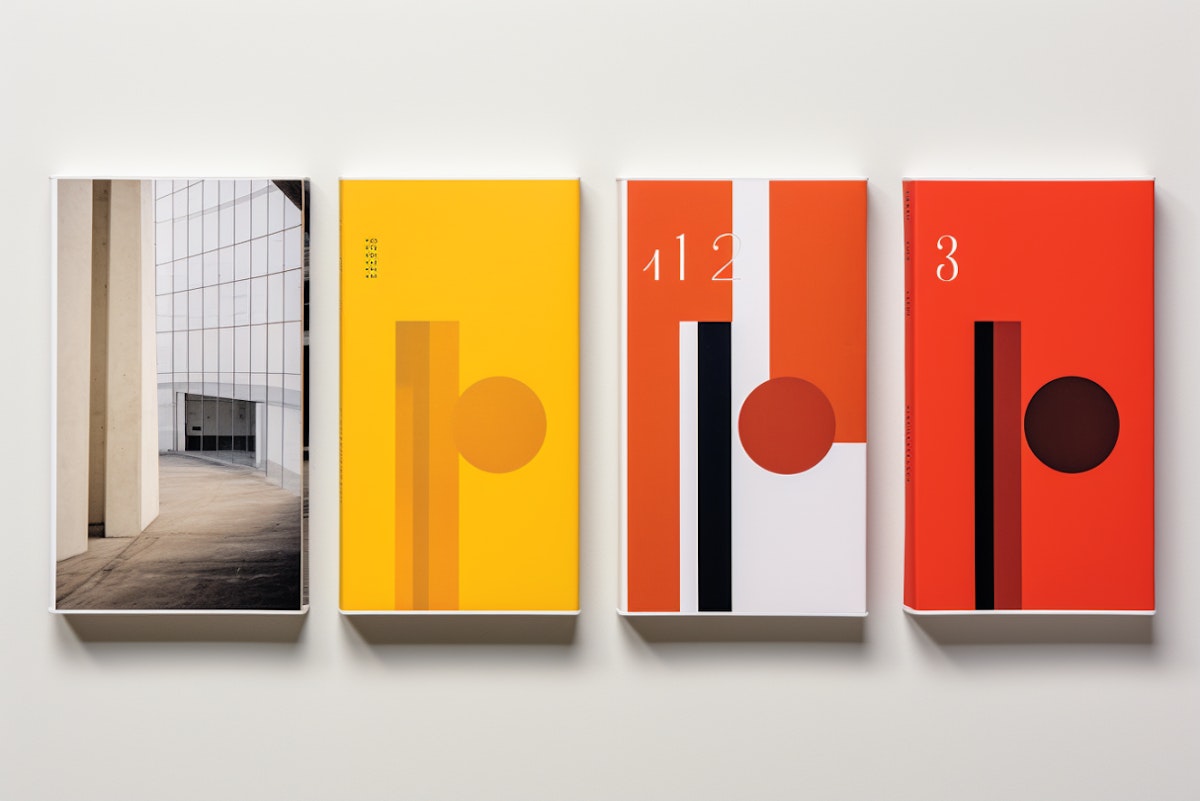
At its core, colour theory revolves around the colour wheel—a tool that helps designers understand the relationships between colours. It includes primary (red, yellow, blue), secondary (green, orange, purple), and tertiary colours, providing a foundation for creating harmonious colour palettes.
Key principles, such as complementary colours (those opposite each other on the wheel) and analogous colours (those next to each other), guide designers in crafting visually pleasing compositions. For instance, using complementary colours like blue and orange creates contrast and vibrancy, while analogous colours like green and yellow bring a sense of harmony.
The concept of colour harmony involves the deliberate arrangement of colours to create a visually pleasing and balanced composition. When colours are thoughtfully paired, they evoke a sense of satisfaction and comfort in viewers. Conversely, a chaotic or poorly balanced use of colour can lead to feelings of confusion or discomfort. For example, secondary colours created by blending two primary colours, plays a vital role in achieving harmony by bridging and complementing hues on the colour wheel.
By mastering colour theory, designers can create visuals that not only look appealing but also resonate with the audience, guiding emotions and actions while achieving a seamless blend of aesthetics and functionality.
Designers must also consider the psychological impact of colour. Red often conveys passion or urgency, while blue evokes calmness and trust. Combining these principles with an understanding of colour accessibility ensures inclusivity, such as using high contrast for readability or avoiding colour combinations that might be challenging for colour-blind users.